Despite the popular expression, I do buy books based on their covers. There are other factors I take into account when deciding which titles to buy and which to keep an eye out for in my library system. But I still can’t help but coo over aesthetically pleasing book design, and sometimes that tips the scales in favor of pulling out my wallet. In the spirit of Halloween, here are some of my favorite spooky covers from the SpiderHouses personal library.
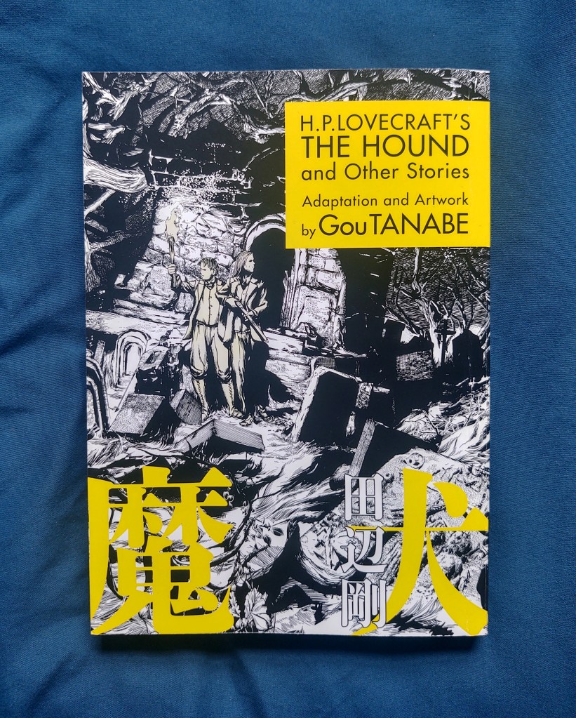
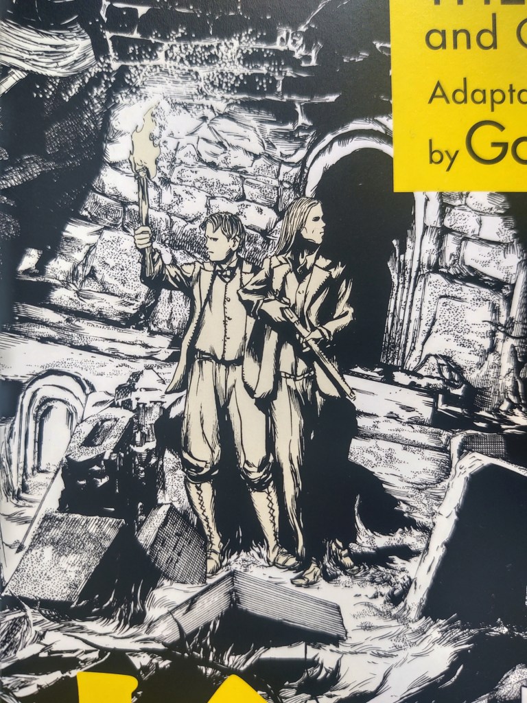
H.P Lovecraft’s The Hound and Other Stories (Dark Horse, 2014) was the first Gou Tanabe work I’ve read, and I found his use of light and shadow stunning. The cover advertises his skill by limiting color to a bright neon yellow for the original Japanese title and the panel with the English title and author name. However, if you look closely, you might be able to discern how the characters have been filled in with a very desaturated yellow. It’s barely noticeable, but helps the figures stand out from their black and white backgrounds without melting into the noise of the yellow blocks.
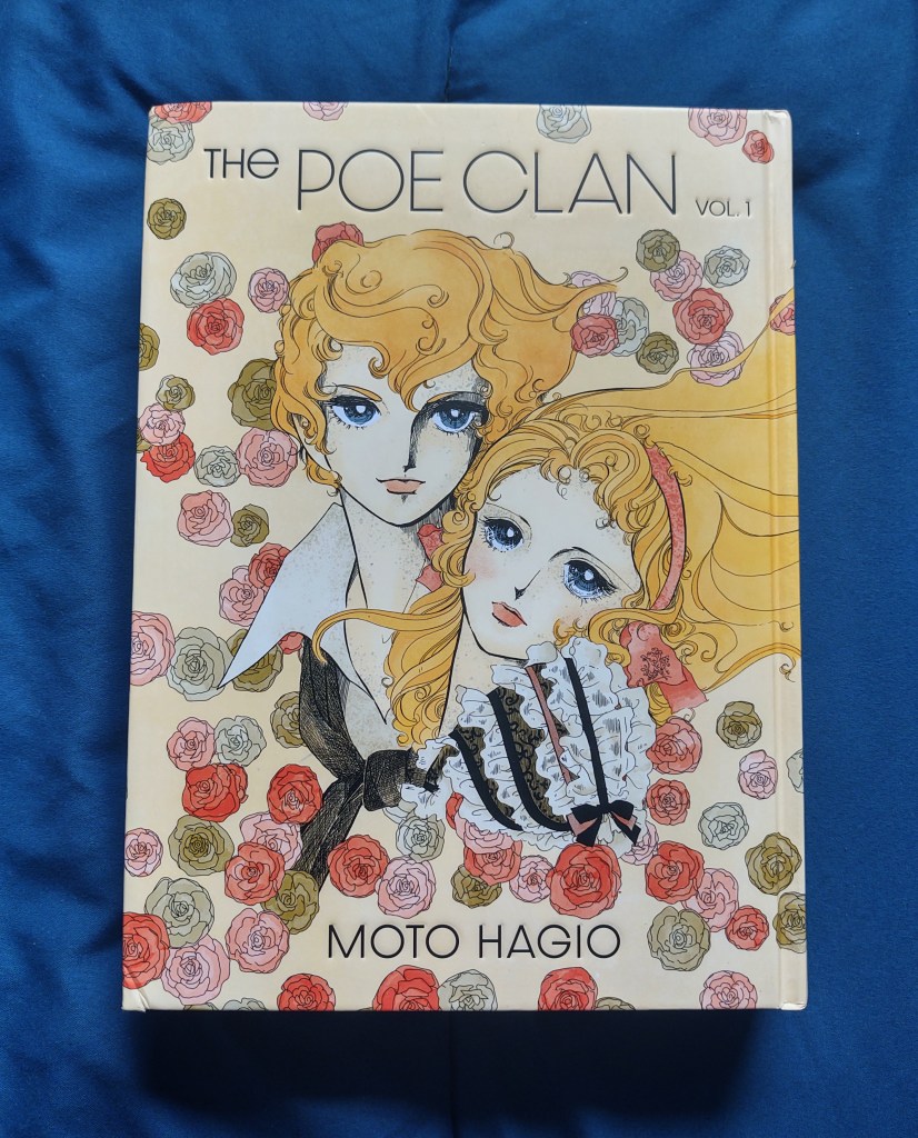
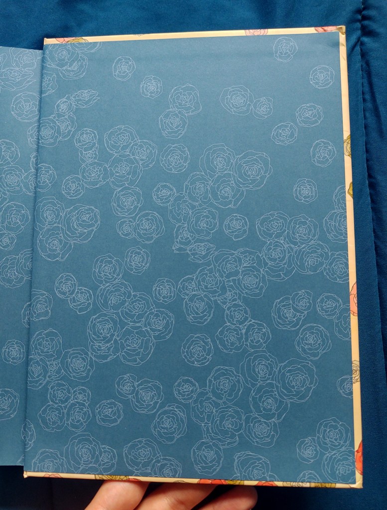
Fantagraphics’ first of two volumes for Moto Hagio’s The Poe Clan (2019) has a deboss for the title and author. The grey speckling on the characters’ faces could be an allusion to how Hagio’s vampires turn into dust when they die. The rose motif in the background, a reference to the clan’s home village, carries over to the inside covers. I especially like how the colors used for the roses give an antique feel, seeing as that is essentially what the main characters are — antique humans floating through the centuries.
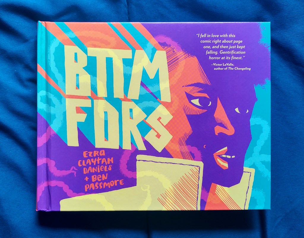
The cover for BTTM FDRS (Fantagraphics, 2019) might seem like a strange choice for a horror story, but it really couldn’t have been done any other way. Artist Ben Passmore’s style is usually colorful, and his work in BTTM FDRS is especially so.
I think the vibrant, blockish splattering of color on this cover acts as a homage to the comics’ predecessor. The story for BTTM FDRS was inspired by Candyman, a 1992 movie about a fictional urban legend set in the Cabrini-Green housing projects. Some scenes were filmed on location and feature the housing project’s graffiti. You can catch a few glimpses of it in the official trailer.
And as if all that pop wasn’t enough, a speckling of deboss is also added to the creator names and slinking offal shadows for an extra layer of texture.
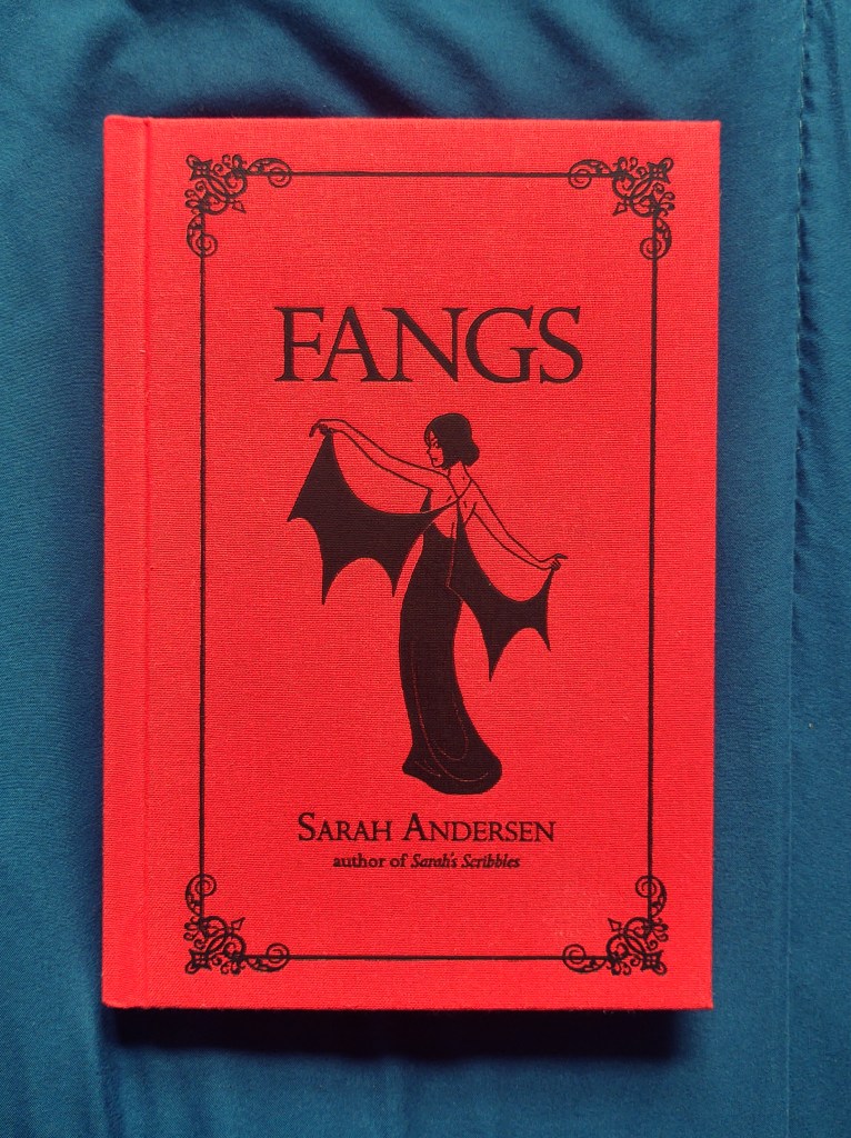
Fangs (Andrews McMeel) was on my 2020 release #tbr list, but I hadn’t planned on buying it. But I spent a minute flipping through a copy when saw it on display at Barnes & Noble and, based on the physical feel of the book, couldn’t put it back on the shelf.
The cover is red cloth with an inky black deboss for the title, author, illustration, and a lacy decorative border. Andrews McMeel commits to the deboss by including a slip-on sleeve for the more text-heavy publishing information. All this is topped off with black edge-inking. The resulting aesthetic is like a forgotten diary, or an old collection of violent fairy tales, or a secret narrative rendered invisible by its missing dust jacket.
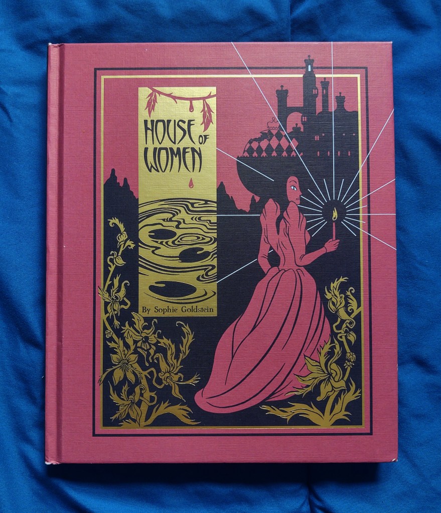
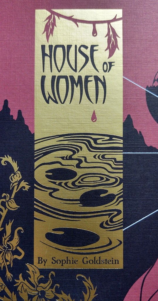
Sophie Goldstein’s art in House of Women (Fantagraphics, 2017) is exclusively black and white. Instead of shades of grey, shadow and texture is created via variations in line thickness and density. This technique is not unlike woodblock printing. Goldstein’s cover design further emphasizes her technique by overlaying a gold leaf tab and then cutting away to reveal the red and black matte underneath, thus shaping the title, author, and an illustration of a lily pad pond. The gold also creates contrast with the shadowy background and mimics the flickering of the candle flame.
What are some of your favorite horror covers?

One Comment Add yours