I haven’t written much about picture books here because I tend to connect with my favorites on a deeply personal level.
By “deeply personal” I mean I tear up because I wish more of my close friends had kids for me spoil with gifts of gorgeous books.
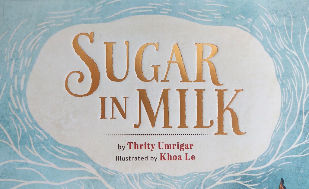
But last week I read Sugar in Milk (Running Press, 2020). I adored it not only because it was a sweet story with beautiful art, but because it utilized a bit of design play to mimic its narrative. The book cover even hints at the graphic ingenuity inside.
Sugar in Milk is a story within a story. On the outside, we have a young immigrant girl struggling to adapt to her new life with her aunt and uncle in America. On the inside, there’s the aunt’s parable about refugees and a foreign king overcoming their language barrier via a cup of milk.
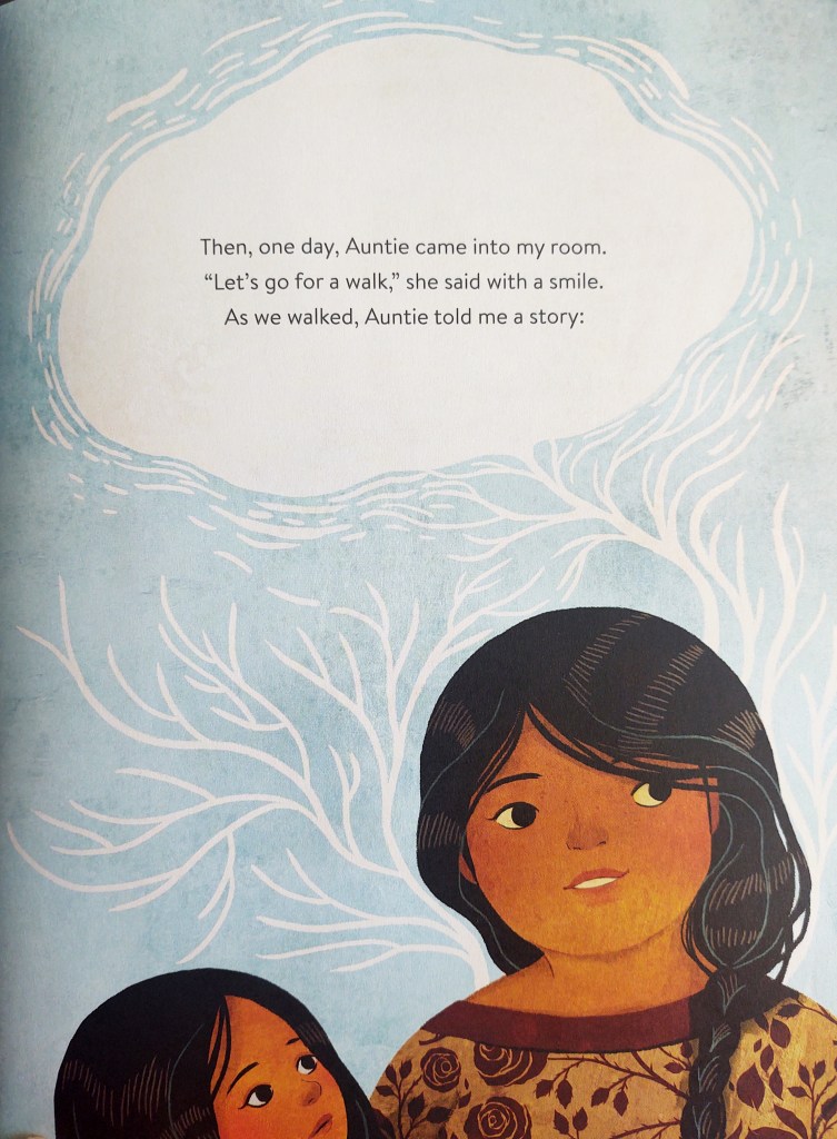
The book’s text starts in a sans serif typeface. Sans serif fonts are perceived as more modern, and iconic sans serif typefaces like Arial, Helvetica, and Futura are less than a hundred years old. When the aunt begins telling the main story, the text is enveloped in a cloud-like shape not unlike a speech or thought bubble.
Branching extensions of this bubble carry over to the next page. A fancy script font starts the aunt’s tale communicating the same formality of the traditional “Once upon a time.” But then, the text shifts into a serif typeface. Serifs are usually perceived as more “traditional” or “classic” because several iconic serif typefaces are centuries old. Caslon, which was featured in the Declaration of Independence and is used for body text in The New Yorker magazine, has been around since 1725, and Garamond, which is used in Abercrombie & Fitch logo, is over 450 years old.
After the branches of the text bubble-cloud motif dissipates, the pages of the aunt’s story are enclosed in a decorative border, much like the edges of a narrative tapestry or the window frames of stained glass in a cathedral.
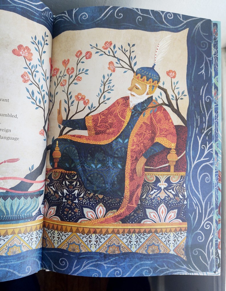
Once the aunt finishes her story, the borders disappear, the text reverts back to sans serif, and the wispy cloud motif (albeit, in the magical form of birds) returns to carry us back into the present day, where the young girl uses the lessons of the parable to connect with her new neighborhood.
Major props to illustrator Khoa Le and designer Frances J. Soo Ping Chow for their work on this book!
